Flat 30% off for Singapore 🇸🇬

Inspiration · Startups

The best startup websites for design inspiration

Modern startups that nail first impressions — distinctive brand, clear story, and the polish that makes an early company look fundable.

A startup's website is its first impression on customers and investors, and startup website design is judged in about three seconds — before anyone reads a word. The best ones combine a distinctive brand, a claim specific enough to argue with, and enough polish to look a stage ahead of where the company actually is. Every screenshot below was captured from the live site, so what you see is what the site shows today rather than how it looked when some listicle was written. Two opposing strategies run through the set: near-silent restraint (Vercel, Linear, Mercury) and loud typographic confidence (Pitch, Arc). Both work. What never works is the beige middle.
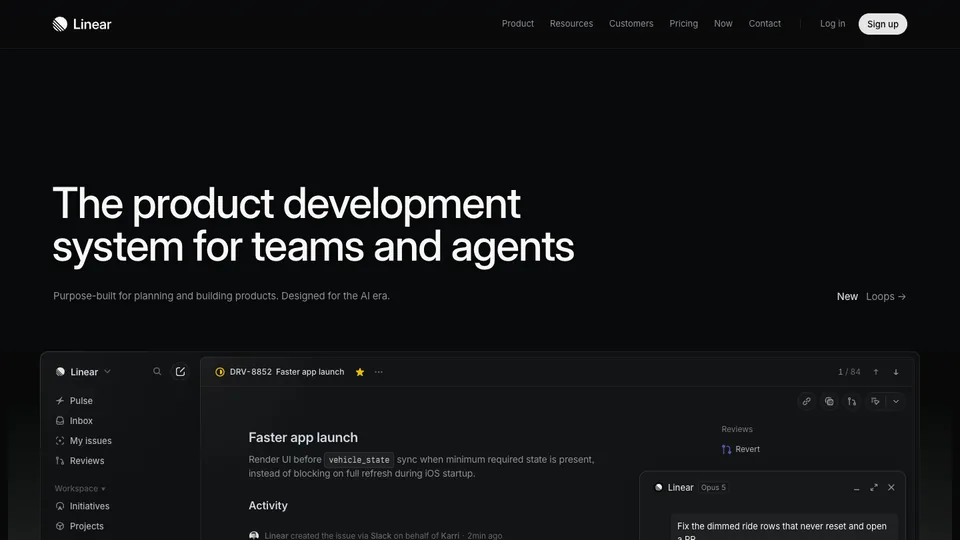
Linear website homepage

Linear

Still the reference for restrained product marketing, and now repositioned around agents — "the product development system for teams and agents". Note how the hero shows the actual product at full fidelity rather than an abstract illustration.

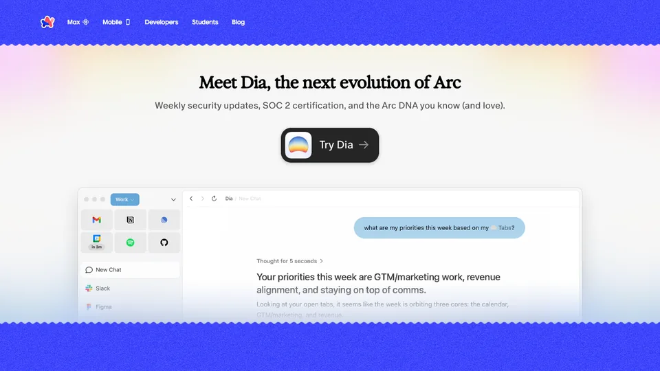
Arc website homepage

Arc

Worth studying as a live example of a pivot handled in public: arc.net now leads with Dia, the successor product, rather than Arc. If your company changes direction, this is what the transition looks like on the homepage.

Vercel website homepage

Vercel

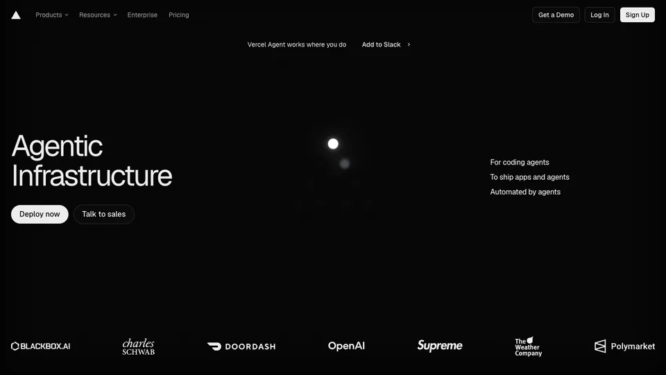
Near-monochrome, with the positioning compressed to two words — "Agentic Infrastructure" — and a customer logo wall doing the credibility work directly below it. Almost no adjectives anywhere.

Mercury website homepage

Mercury

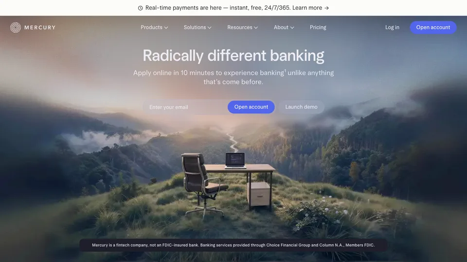
The clearest proof that calm design reads as trustworthy in finance. Wide photographic hero, one claim, and the regulatory disclosure kept visible rather than buried — which is itself a trust signal.

Retool website homepage

Retool

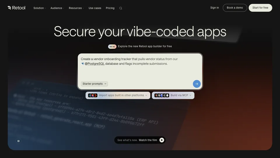
A masterclass in topical positioning: the hero is currently "Secure your vibe-coded apps", aiming the product at a problem that only started existing recently. The hero states a job, not a category.

Pitch website homepage

Pitch

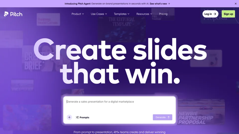
Loud, brand-led and typographic — "Create slides that win" set enormous over a saturated purple field. The opposite strategy to Vercel, and it works because the category is crowded and beige.

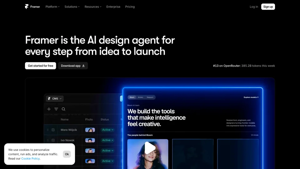
Framer website homepage

Framer

The tool's own site is its strongest demo, now positioned as "the AI design agent for every step from idea to launch". Watch how much of the page is product footage rather than description.

Cron / Notion Calendar

Calendar

Cron / Notion Calendar

Focused single-product storytelling with a clear hero and one obvious next step — the calm end of the spectrum next to Pitch.

Want a site this good?

I design and build at this level on a fixed price and a fixed date — website in 14 days, $1,999, source code yours.

See the 14-day plan

Common questions

Questions, answered

A distinctive brand, a clear and specific value proposition, real polish (motion, hierarchy, speed), and proof. The goal is to look credible and fundable beyond your actual stage.

Work with me

Want a site that belongs on this list?

I design and build launch-ready sites for founders — custom, fast, and live on your domain.

  • Fixed price from $700 — no hourly surprises
  • Design, build and deploy handled end to end
  • 75+ projects shipped · 4.93 avg rating

More inspiration