Flat 30% off for Singapore 🇸🇬

Inspiration · SaaS

The best SaaS landing pages for design inspiration

A curated set of SaaS marketing sites that get the fundamentals right — clear positioning, strong hierarchy, and conversion-focused design.

The best SaaS landing pages do one thing well: they make a complex product understandable in about five seconds. Every screenshot here was captured from the live site, and I also pulled each site's live headline on 30 August 2026 to check a hunch. Four of these twelve — Linear, Notion, Vercel and Framer — now lead with agents or AI, where a year ago they led with speed, flexibility or developer experience. A third of the set, not the whole category, which is worth saying plainly because the shift feels larger than it measures. Study the hierarchy and the proof placement rather than the wording, because the wording is the part that is moving.
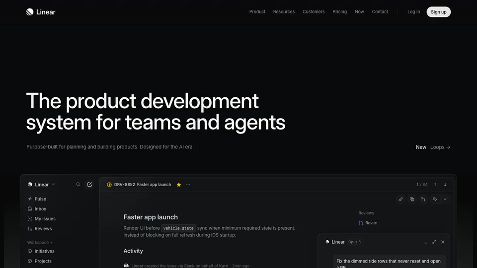
Linear website homepage

Linear

Still the reference for restraint, now framed around agents as well as teams. The hero shows the real product at full fidelity rather than an abstraction of it.

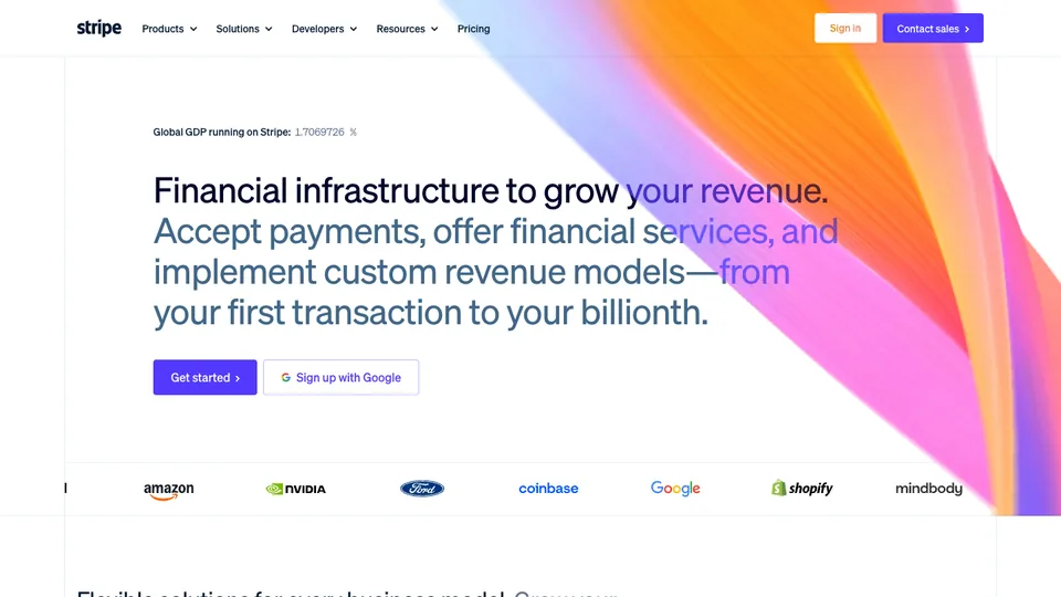
Stripe website homepage

Stripe

Sets the bar for developer-facing design: gradient craft, animated product visuals, and clarity at every scroll depth.

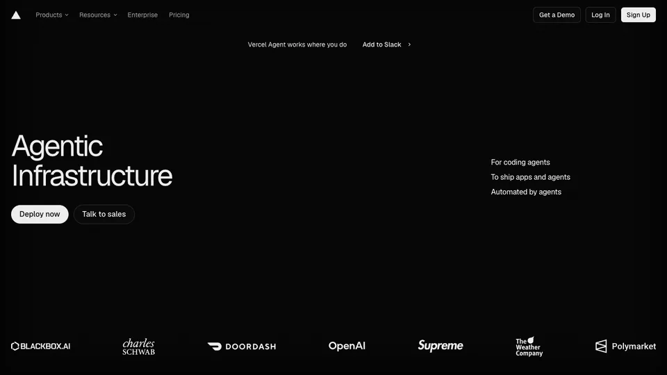
Vercel website homepage

Vercel

Near-monochrome, with the entire positioning compressed to two words — "Agentic Infrastructure" — and a customer logo wall carrying the credibility directly beneath it.

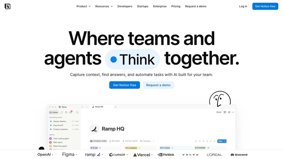
Notion website homepage

Notion

Repositioned around agents, with a rotating verb in the headline — "where teams and agents think / jam / build together" — so the positioning holds still while the promise cycles. Notably calmer and more product-led than the illustrated era Notion is known for.

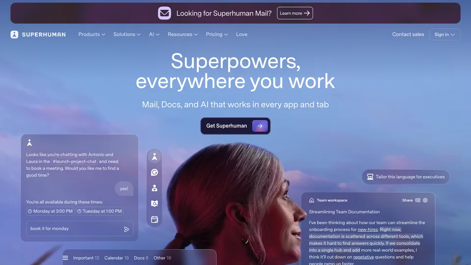
Superhuman website homepage

Superhuman

Sells a feeling rather than a feature set — "superpowers everywhere you work" over a single portrait, with the premium price justified by tone alone.

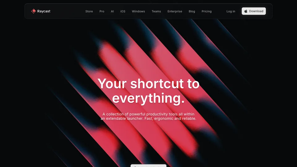
Raycast website homepage

Raycast

Dark, dense, and delightful — leans into its power-user audience with motion and personality.

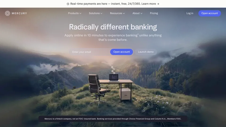
Mercury website homepage

Mercury

Calm, trustworthy, and beautifully typeset — financial software that feels modern without trying too hard.

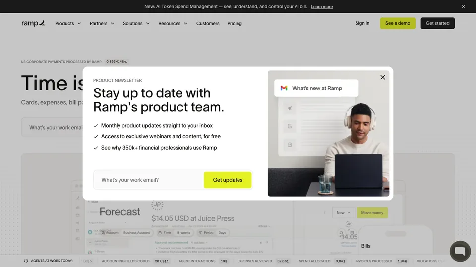
Ramp website homepage

Ramp

Outcome-led messaging ('save more') paired with clean product shots and unmistakable CTAs.

Framer website homepage

Framer

Its own site is the demo, now positioned as "the AI design agent for every step from idea to launch". Most of the page is product footage rather than description.

Retool website homepage

Retool

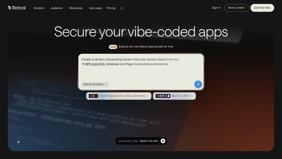
Currently leads with "Secure your vibe-coded apps" — a hero aimed at a problem that did not exist two years ago. The headline states a job, not a category.

Cron website homepage

Cron

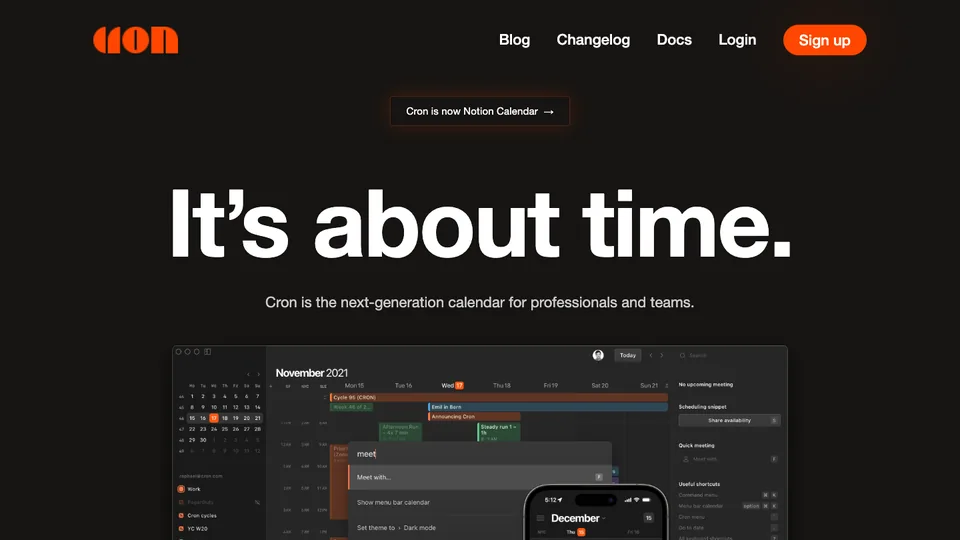
Restrained, premium, and keyboard-first — a landing page that mirrors the product's quiet precision.

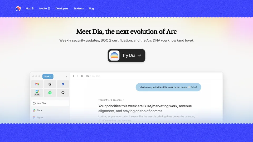
Arc website homepage

Arc

Now the clearest example of a public pivot: arc.net leads with Dia, the successor product, not Arc. Worth studying for how a company retires a beloved product without abandoning its audience.

Want a site this good?

I design and build at this level on a fixed price and a fixed date — landing page in 5 days, $700, source code yours.

See the 5-day plan

Common questions

Questions, answered

A sharp value proposition above the fold, clear visual hierarchy, real product visuals, social proof, and a single obvious call to action. Speed and mobile experience matter just as much as looks.

Work with me

Want a site that belongs on this list?

I design and build launch-ready sites for founders — custom, fast, and live on your domain.

  • Fixed price from $700 — no hourly surprises
  • Design, build and deploy handled end to end
  • 75+ projects shipped · 4.93 avg rating

More inspiration