Form Design Best Practices: 15 Rules for Forms People Finish
Fifteen rules for forms people actually finish, from what to ask to how to show errors, each backed by Nielsen Norman Group, the W3C, GOV.UK or Baymard research.

Shaheer Malik
Framer Designer & Developer
Quick answer
Forms people finish ask for less, explain more and never surprise anyone: cut every field you will not use, put labels above fields in one column, mark optional fields, show formats before people type, and keep errors next to the field with the answer kept.
Forms people finish ask for less, explain more and never surprise anyone. The 15 rules below come from Nielsen Norman Group, the W3C, GOV.UK and Baymard Institute: cut every field you won't use, put labels above fields in one column, mark optional fields, show formats up front, and keep errors next to the field with the answer kept.
I design forms for client websites and I make Forms, a form builder. These rules hold in any tool, and each one links to the research behind it.
Why does form design matter so much?
Because most people who start a form don't finish it if it fights them. Zuko's form analytics benchmarks put the share of people who start a form and abandon it at 34%. And in its guide to website form usability, Nielsen Norman Group reports that users are almost twice as likely to submit with no errors on the first try when forms follow basic usability guidelines.
The rules below are those basic guidelines, in the order I check them on a client project.
What are the rules for what you ask?
1. Ask only for what you'll use
Every field costs effort. Baymard Institute found the average checkout in 2024 had 11.3 form fields when most sites need only 8. For each field, ask: what will I do with this answer? If there's no answer, delete it.
2. Ask later what you don't need now
A sign-up needs an email, not a job title and company size. Collect the rest after people have seen value, in onboarding or a profile page.
3. Be careful with passwords and phone numbers
Zuko's data shows registration forms have by far the most returns to fields, largely because of strict password rules. Explain password requirements before people type, not after they fail, and make phone numbers optional unless you'll actually call.
4. Mark what's optional
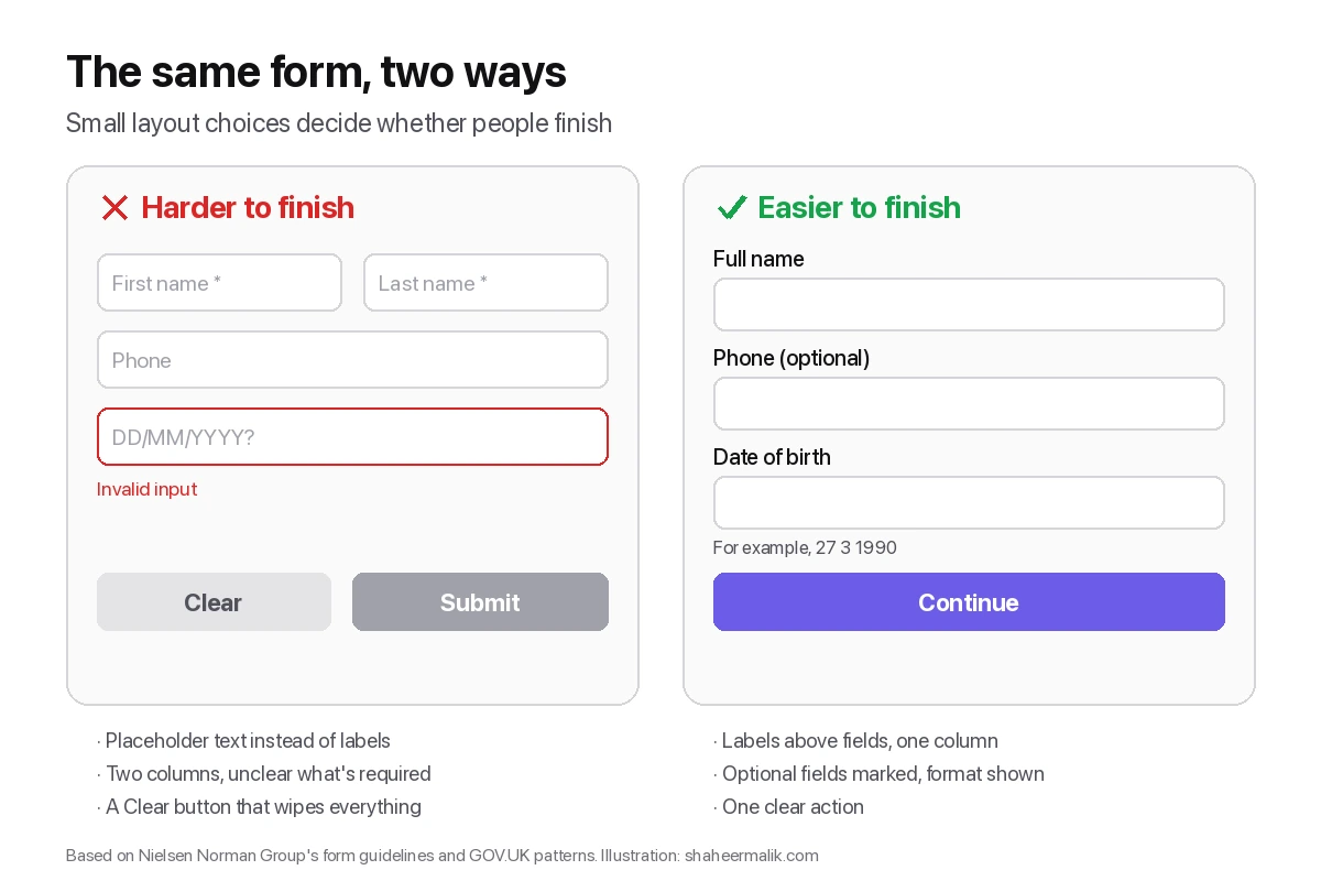
Nielsen Norman Group recommends clearly marking required versus optional fields. Writing "(optional)" next to the few optional fields is clearer than a row of asterisks people have to decode.
What are the rules for layout?
5. One column
A single column keeps people moving down the page without zig-zagging. Nielsen Norman Group lists it among its top recommendations; two columns invite people to skip fields.
6. Labels above fields, not inside them
Placeholder text disappears when you type, so people forget what a field was for and can't check their answers. Nielsen Norman Group advises against placeholder text as labels. Put a real label above every field; the W3C forms tutorial also requires every control to have a label for accessibility.
7. Group related fields
Put address lines together, contact details together, payment together, with a short heading for each group. The W3C tutorial uses grouping so screen readers announce which group a field belongs to.
8. Order fields the way people think
Name before email, street before city, easy questions before hard ones. Following familiar sequences means fewer pauses.
9. Size fields to the answer
A postcode field shouldn't be as wide as a message box. Field width is a quiet hint about how much to type.
What are the rules for instructions and errors?
10. Show formats before people type
"For example, 27 3 1990" under a date field prevents the error. Nielsen Norman Group recommends stating formatting requirements up front instead of letting people guess.
11. Put errors next to the field and keep the answer
Say what's wrong and how to fix it, beside the field, without clearing what was typed. Nielsen Norman Group recommends several visual cues for errors (not colour alone) and preserving input.
12. Remove Reset and Clear buttons
Nobody needs to wipe a form, and plenty of people have done it by accident. Nielsen Norman Group lists removing them as a top recommendation.
13. One clear action
Label the button with what happens next, such as "Continue" or "Send request", rather than a generic "Submit".
What are the rules for long forms?
14. Break long forms into steps, and show progress
The W3C tutorial recommends dividing long forms into logical steps and telling people where they are. The GOV.UK Design System goes further and recommends one question per page by default. I compared both approaches in one question at a time vs one long page.
15. Use logic so people skip what doesn't apply
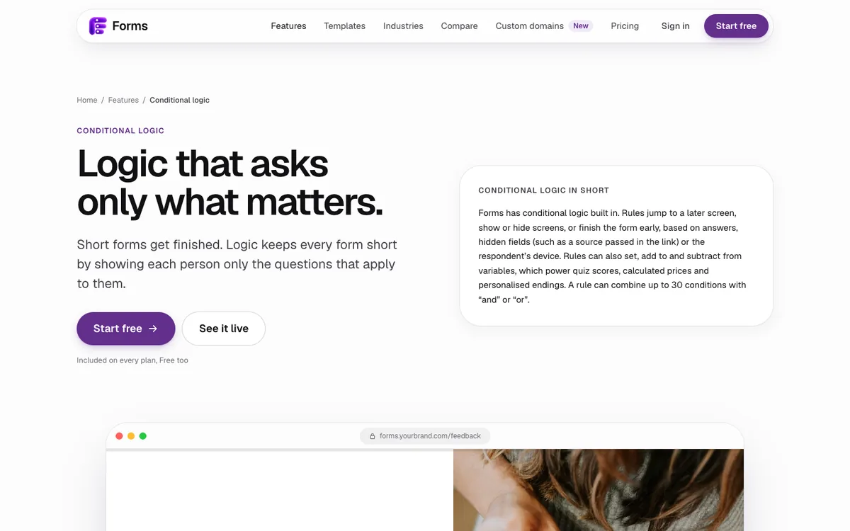
If someone says they don't have a website, don't ask for its URL. Conditional logic shortens the form for everyone without removing a single question from it.
How do you write good form labels?
Make every label short, specific and in plain words. "Work email" is better than "Email" if you need a work address; "Company size" is vaguer than "How many people work at your company?". In a one-question-per-screen form, write the label as a question, the way you'd ask it out loud.
Use sentence case, avoid jargon and internal names, and put any explanation in a hint under the label rather than in the label itself. If a field needs a paragraph to explain it, the question probably needs rethinking.
How do you check a form before launch?
Fill it in yourself three ways: on a phone with your thumb, with only a keyboard, and with a screen reader for a minute. Then ask someone who's never seen it to complete it while you watch, without helping. Every pause is a rule above that you missed.
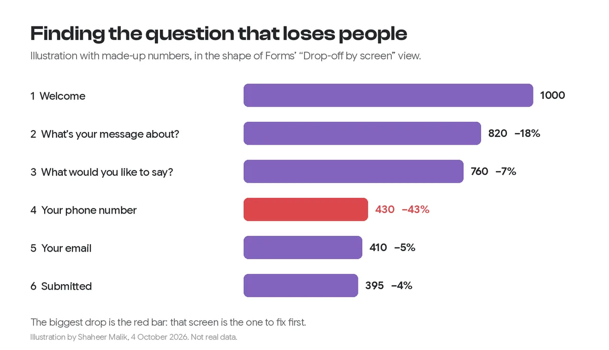
After launch, look at where people drop off. The question with the biggest drop is the one to rewrite or remove first.
How does Forms apply these rules?
Forms builds them in: one question per screen, keyboard support (letters pick answers, Enter continues), conditional logic, progress, and contrast checks on every theme. Results show drop-off by screen, so you can see which question loses people. It's free for one active form and 100 responses a month.
Last updated: 2 October 2026. Build your first form free, no card needed, or talk to me about your project.
FAQ
Frequently asked questions
Ask only for what you will use, put labels above fields in one column, mark optional fields, show formats before people type, keep errors next to the field with the answer kept, and remove Reset buttons.
Want it done for you? I offer website design on a fixed price, from $700. See pricing.