Mastering the Elements of Graphic Design: Unveiling the Secrets of Design Elements and Principles - 2025
Unlock the secrets of design elements and principles in graphic design with our comprehensive guide. Master the element of design to create stunning compositions in 2025.

Shaheer Malik
Framer Designer & Developer
Quick answer
The elements of graphic design are line, shape, form, space, texture, colour and type — the raw materials. The principles — balance, contrast, hierarchy, alignment, repetition and proximity — are how you arrange them. Elements are what you use; principles are how you decide where things go.
Graphic design is a captivating field where creativity meets functionality. In this article, we'll dive deep into the fundamental design elements and principles that form the backbone of all great designs. Whether you're a budding graphic designer or a seasoned professional looking to refresh your knowledge, this guide will help you understand and utilize the basic elements of graphic design effectively.
Understanding the Basic Elements of Graphic Design
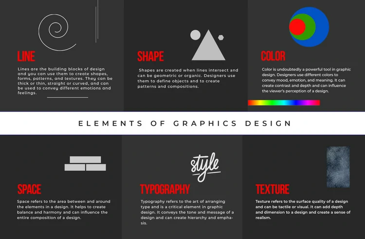
Graphic design relies on a set of core elements that, when combined, create visually appealing and effective designs. These elements are the building blocks of all design work. Let's explore each one in detail:
Line: The Path of a Moving Point
A line is an element of design defined by a point moving in space. It can be straight, curved, thick, thin, solid, or dashed. Lines create boundaries, guide the viewer’s eye, and convey movement. They can be drawn using a ruler or freehand. For instance, geometric lines like those drawn with a ruler can create a sense of order, while organic lines, drawn by hand, can add a natural, flowing feel to a design.
Shape: The Foundation of Design
Shapes are fundamental to graphic design. They can be geometric, such as squares and circles, or organic, like free-form shapes. Geometric shapes provide structure and are often used to create visual interest and focal points in a design. Organic shapes can add a touch of natural beauty and spontaneity. Shapes can also be combined to create complex forms and compositions.
Color: The Power of Hue
Color is one of the most powerful design elements. It can evoke emotions, set a mood, and create a sense of harmony or contrast. Understanding color theory, including the color wheel, is essential for any graphic designer. The right color combinations can make a design pop, while poor choices can make it fall flat. Colors can be warm or cool, and they can affect the viewer's perception and emotions.
Texture: Adding Depth and Tactility
Texture refers to the surface quality of a design element, which can be visual or tactile. Visual texture is the illusion of texture on a two-dimensional surface, while tactile texture can be felt physically. Adding texture to a design can create visual interest and depth, making the design more engaging and realistic. It can be achieved through patterns, images, and even simulated through shading and line work.
Space: The Final Frontier
Space, or negative space, is the area around and between design elements. It’s an important element of design that can enhance readability, create a sense of balance, and draw the viewer's eye to focal points. Proper use of negative space can make a design look clean and uncluttered. It’s the space next to and around elements that gives the design breathing room and can lead to a more aesthetically pleasing composition.
Form: Creating Three-Dimensional Illusions
Form is the element of design that refers to three-dimensional objects or the illusion of three dimensions on a flat surface. Forms can be geometric, like cubes and spheres, or organic, like sculptures and natural objects. Using shading, perspective, and light, designers can create the illusion of form, making two-dimensional designs appear three-dimensional.
Typography: The Art of Type
Typography is the use of text in design. It involves choosing fonts, arranging text, and creating a hierarchy to convey a message clearly and attractively. Typography is crucial in graphic design because it not only communicates information but also contributes to the overall visual appeal. Good typography can make a design look professional and polished, while poor typography can make it look amateurish.
Principles of Graphic Design
In addition to the basic elements, graphic designers use several principles to guide their work. These principles help to create balanced, harmonious, and visually appealing designs. Let’s explore these principles:
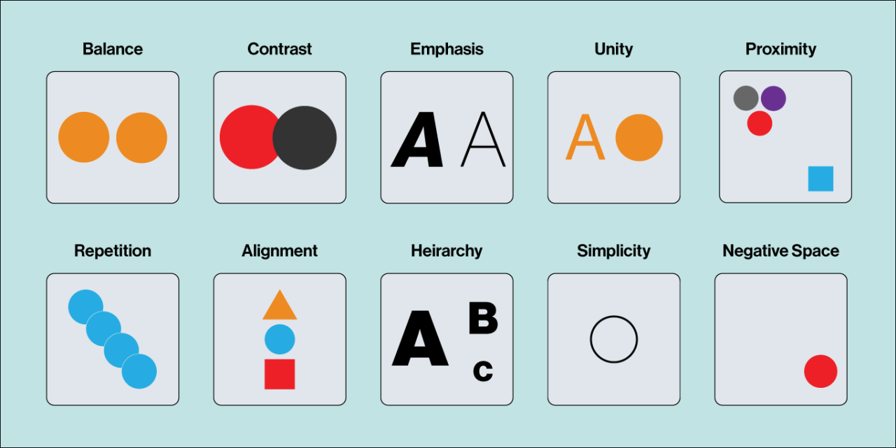
Balance: Achieving Visual Stability
Balance refers to the distribution of visual weight in a design. There are three types of balance: symmetrical, asymmetrical, and radial. Symmetrical balance creates a mirror image on either side of an axis, while asymmetrical balance uses different elements to create a harmonious composition. Radial balance involves elements radiating from a central point. Achieving balance ensures that a design feels stable and complete.
Contrast: Creating Visual Interest
Contrast involves using opposing elements, such as light vs. dark, large vs. small, or textured vs. smooth, to create visual interest and draw attention to key areas of a design. High contrast can make elements stand out from the space around them, while low contrast can create a more subtle and harmonious look. Effective use of contrast helps to emphasize important parts of the design and guide the viewer’s eye.
Emphasis: Drawing the Eye
Emphasis is about creating a focal point in a design to draw the viewer's attention. This can be achieved through contrast, size, color, or placement. A well-emphasized element stands out from the surrounding space and captures the viewer’s eye. It’s important to use emphasis sparingly to avoid overwhelming the viewer and to maintain a clear visual hierarchy.
Unity: Creating Harmony
Unity is the principle that ties all the design elements together to create a cohesive and harmonious design. It ensures that all parts of the design work together to create a whole. This can be achieved through repetition, alignment, and proximity. Unity makes a design look organized and aesthetically pleasing, ensuring that each element of design contributes to the overall message.
Movement: Guiding the Viewer’s Eye
Movement is the path the viewer's eye takes through a design. It’s about creating a sense of flow and directing the viewer's attention to important areas. Lines, shapes, and colors can be used to create a sense of movement, leading the viewer from one element to the next. Movement helps to create a dynamic and engaging design.
Proportion: Creating a Sense of Scale
Proportion refers to the size relationship between different elements in a design. It’s important to maintain proportion to ensure that the design looks balanced and natural. Proper proportion helps to create a sense of order and harmony, making the design more visually appealing.
Rhythm: Creating Repetition and Pattern
Rhythm is about creating a sense of movement and flow through repetition and pattern. Repeating elements such as shapes, lines, and colors can create a visual rhythm, making the design more engaging and dynamic. Rhythm helps to unify the design and guide the viewer’s eye through the composition.
Applying the Elements and Principles in Graphic Design
To create visually appealing and effective designs, it’s important to understand how to use these elements and principles together. Here are some tips on how to apply them in your graphic design work:
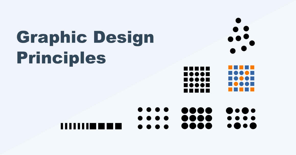
Combining Elements to Create Visual Interest
Using a combination of different elements such as lines, shapes, and colors can create visual interest and make your design more engaging. For example, using organic shapes with geometric lines can create a dynamic and visually appealing composition.
Creating a Visual Hierarchy
A clear visual hierarchy helps to guide the viewer’s eye through the design and emphasize important elements. Use size, color, and placement to create a hierarchy and ensure that the most important elements stand out.
Using Negative Space Effectively
Negative space is just as important as the elements themselves. Use negative space to create balance, improve readability, and make your design look clean and uncluttered.
Experimenting with Color Combinations
Color combinations can have a big impact on the look and feel of your design. Experiment with different color schemes to find the right combination that conveys the desired mood and message.
Adding Texture for Depth
Texture can add depth and tactile quality to your design. Use visual texture to create a sense of realism and make your design more engaging.
Achieving Balance and Harmony
Ensure that your design is balanced and harmonious by using the principles of balance, unity, and proportion. A well-balanced design feels stable and complete, while unity and proportion create a cohesive and harmonious look.
Conclusion
Mastering the basic elements and principles of graphic design is essential for creating visually appealing and effective designs. By understanding and applying these fundamental concepts, you can create designs that not only look good but also communicate the desired message clearly and effectively. Whether you’re a beginner or a seasoned graphic designer, these principles will help you to enhance your design work and achieve great results.
Key Takeaways
Line: Use lines to create boundaries, guide the viewer’s eye, and convey movement.
Shape: Utilize geometric and organic shapes to create structure and visual interest.
Color: Understand color theory and use the right color combinations to evoke emotions and set the mood.
Texture: Add depth and tactile quality to your design with visual texture.
Space: Use negative space to create balance and improve readability.
Form: Create the illusion of three-dimensional objects on a two-dimensional surface.
Typography: Use typography effectively to communicate information and enhance visual appeal.
Balance: Achieve visual stability with symmetrical, asymmetrical, or radial balance.
Contrast: Create visual interest by using opposing elements.
Emphasis: Draw the viewer’s attention to key areas with emphasis.
Unity: Ensure all elements work together harmoniously.
Movement: Guide the viewer’s eye through the design with movement.
Proportion: Maintain proper size relationships between elements for a balanced look.
Rhythm: Create repetition and pattern to make your design more engaging.
By incorporating these design elements and principles into your work, you can create stunning and effective graphic designs that stand out and convey your message powerfully.
FAQ
Frequently asked questions
The basic design elements in graphic design include line, shape, color, texture, space, form, and typography. These elements are fundamental to creating visual communication and are used by graphic designers to build engaging and effective designs.
Want it done for you? I offer branding on a fixed price, from $700. See pricing.