BodyBuddy Brand Guidelines: An AI Fitness Brand, Case Study
How I built the brand identity and guidelines for BodyBuddy, an AI fitness coaching app, from logo and color to typography and brand application.

Shaheer Malik
Framer Designer & Developer
Quick answer
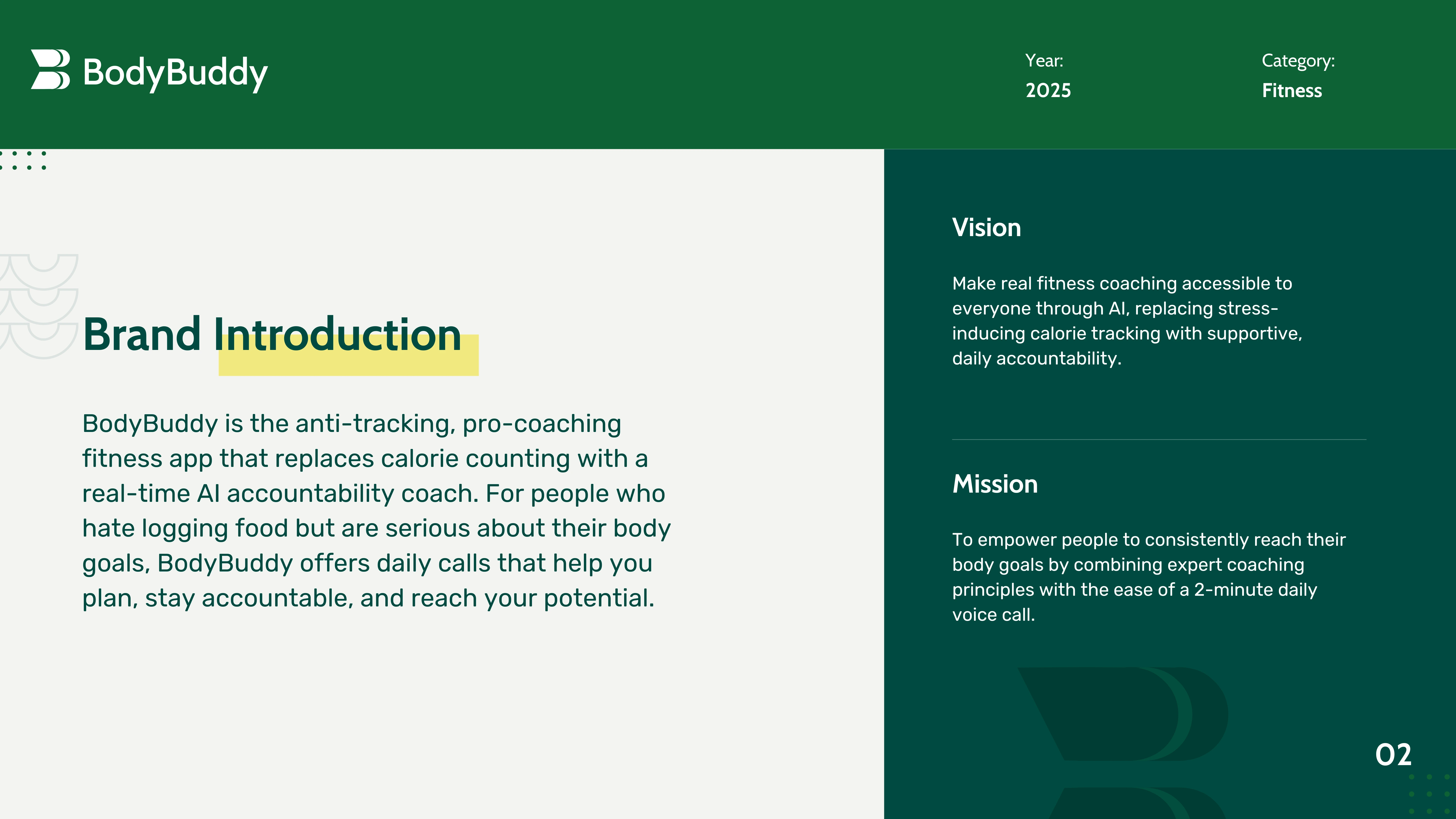
BodyBuddy is an AI fitness app that replaces calorie counting with daily AI coaching calls, positioned as anti-tracking and pro-coaching. I built the brand from scratch in five days — strategy, logo, colour, typography and full guidelines — so the identity carries the same reassurance the product promises rather than the usual fitness-app intensity.
BodyBuddy is an AI fitness app that replaces calorie counting with daily AI coaching calls. The positioning is simple: anti-tracking, pro-coaching, support over stress.
My job was to build the brand from the ground up. This case study walks through the identity and the guidelines I delivered, so the product looks as confident as its promise.
Quick facts
| Detail | |
|---|---|
| Client | BodyBuddy (AI fitness coaching app) |
| Category | Health tech / fitness |
| Timeline | Five days |
| Scope | Brand strategy, logo, color, type, guidelines |
| Tools | Figma, Adobe Illustrator, Notion |
The challenge
BodyBuddy is built against a category norm. Most fitness apps push tracking, numbers, and a little daily stress.
The brand had to feel like a supportive coach, not a scoreboard. It also had to work everywhere, from the app UI to investor decks to social posts. That meant a clear, documented system, not just a logo.
The brand system
I designed a complete identity and wrote the rules for using it. Here are the core pieces.
Logo
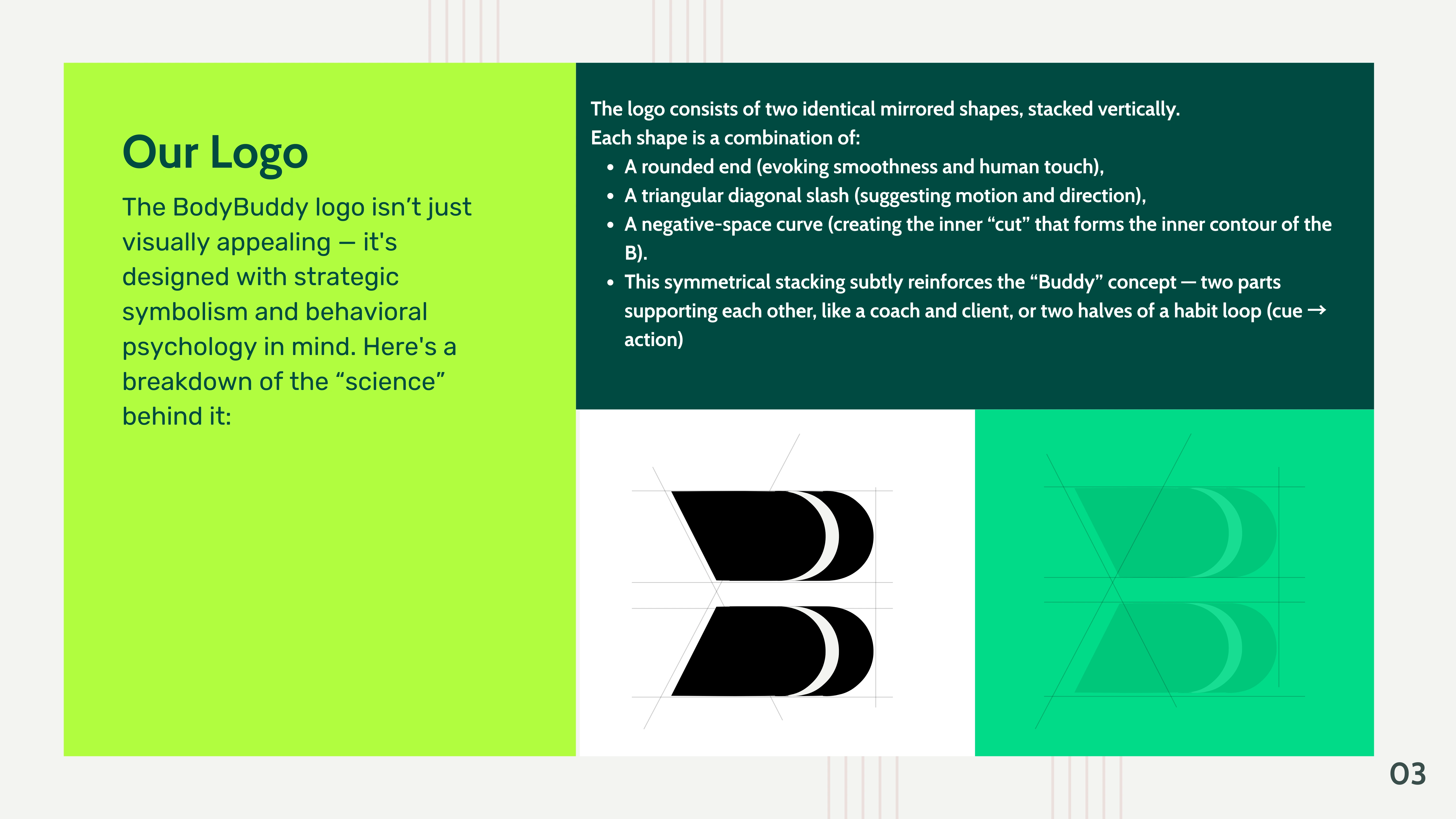
The mark uses two mirrored shapes that support each other. It is a quiet nod to the idea of a buddy, a coach by your side.
Color
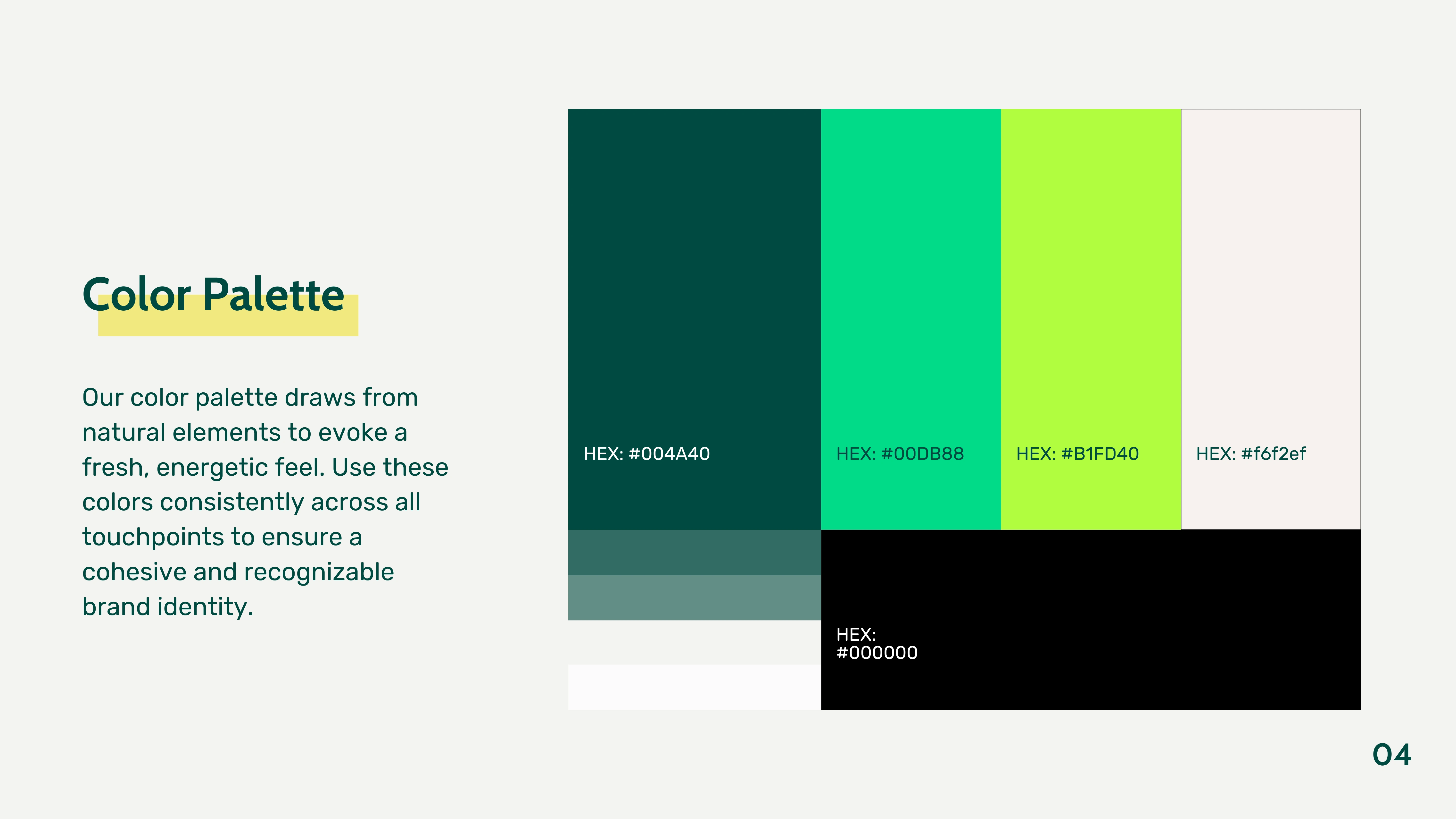
The palette is natural and energetic, not clinical. Deep green grounds it, while the lime and aqua bring the lift of a good workout.
| Color | Hex |
|---|---|
| Deep Green | #004A40 |
| Aqua | #00DB88 |
| Neon Lime | #B1FD40 |
| Sand | #f6f2ef |
Typography
The type pairs Cabin and Rubik. Both are friendly and highly legible, which suits a coach that speaks plainly.
Brand application and rules
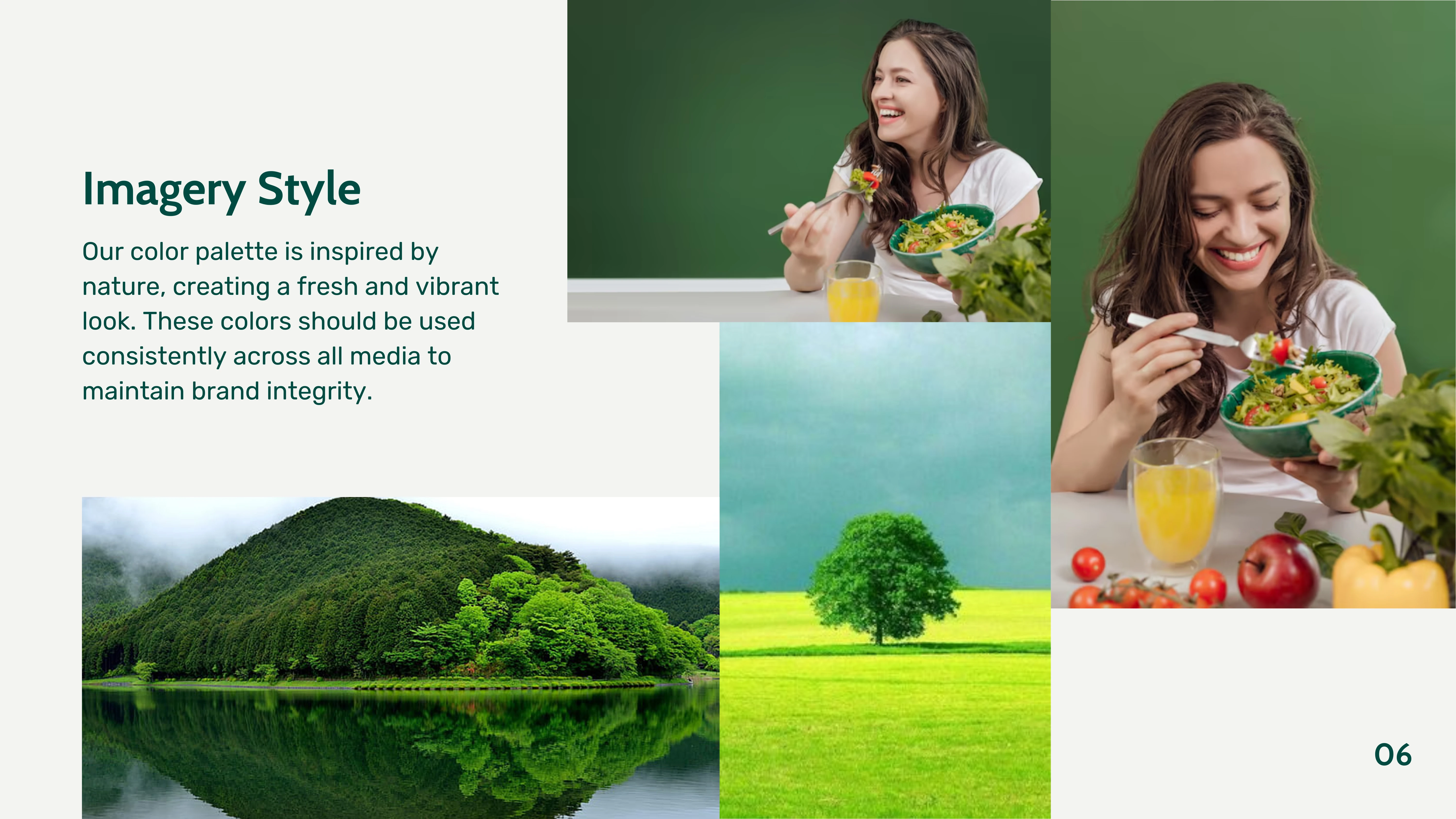
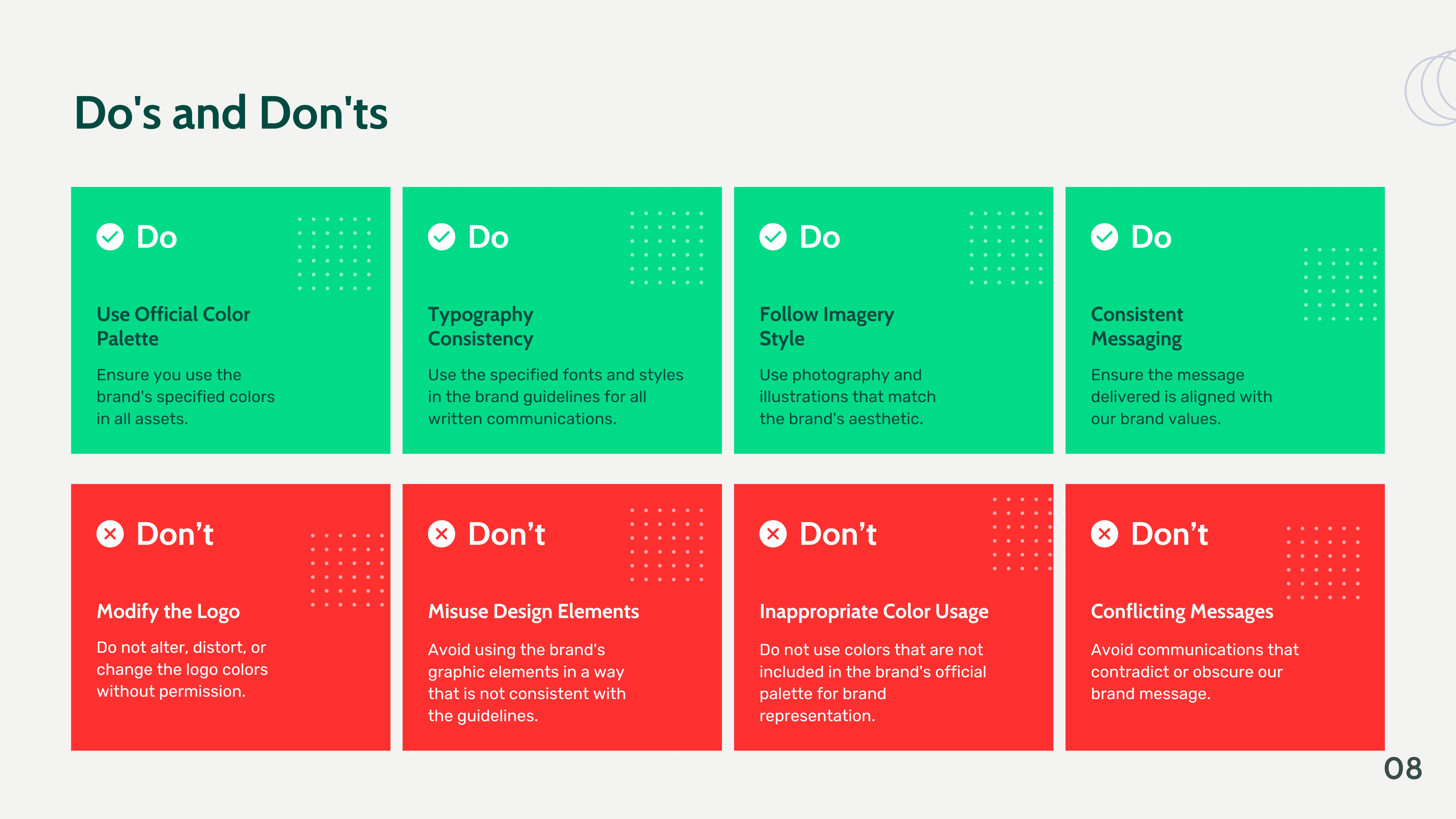
Guidelines only work if people can apply them. So I documented imagery direction, real application examples, and a clear do's and don'ts guide.
The imagery avoids sterile gym photos in favor of natural, vibrant scenes. Every rule exists to keep the brand consistent as the team grows.
See it in motion
Here is a short walkthrough of the finished guidelines.
The outcome
The guidelines gave BodyBuddy one consistent voice across every touchpoint, from app UI to investor decks to social content.
The result communicates the product's promise on sight: accessible coaching, without the calorie counting. This kind of brand work pairs naturally with AI product design.
Want a brand like this?
I build brand identities and guidelines for startups, often alongside the product and site. See my branding service, my full services, or get a fixed quote.
FAQ
Frequently asked questions
A full brand identity and guidelines for BodyBuddy, an AI fitness coaching app, covering logo, color, typography, imagery, and brand application.
Want it done for you? I offer website design on a fixed price, from $700. See pricing.